As a frequent user of Autolib, here is a suggestion I made to the company to improve the car dashboard.
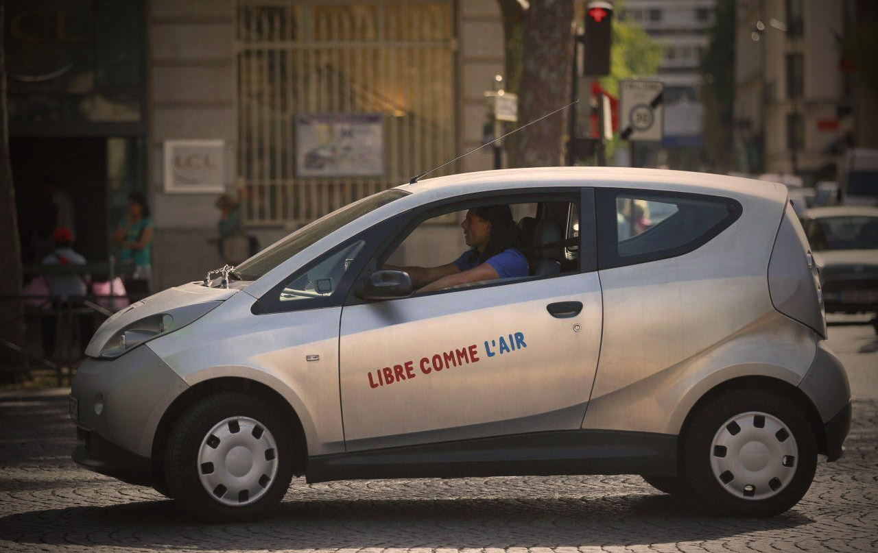
Autolib’ is an electric car sharing service which was inaugurated in Paris, France, in December 2011. I use it since about a year and I am overall very satisfied of the service.
| ADVANTAGES | WEAKNESSES |
|---|---|
| easy to reserve | frequent bugs on stations plugs |
| easy to park | cars cleanliness |
| space in the car | embedded GPS Does not consider the traffic |
| simplicity of use | cost |
Details of the problems
Here I detail some inconsistencies I found and proposed solutions to make the car dashboard clearer and more user friendly.
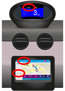
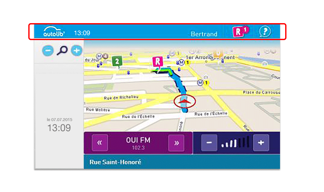
3 Clocks ?
On the dashboard, there are two different screens and we can count 3 different clocks that display the current time. Sometimes, they don’t display the same hour cause they don’t seem to be based on the same operating system. I don’t think it is necessary to display 3 different clocks. The best place for the hour is in the top screen near the speed at the eyes line, because it is an info we want to check often.
Maladjusted visibility
I am 6’0 tall, average size for a French man, but when I drive, I can’t read the area displayed on the top of the screen. The problem is due to the depth of framing around the screen that hides a part of the dashboard in the driving position. One solution could be to redesign the whole panel to be completely flat. But now, hundreds of cars are already on service and they are not going to be replaced before some time, so I think for the company it’s better to work on the software layer : removing important information from this part of the screen.
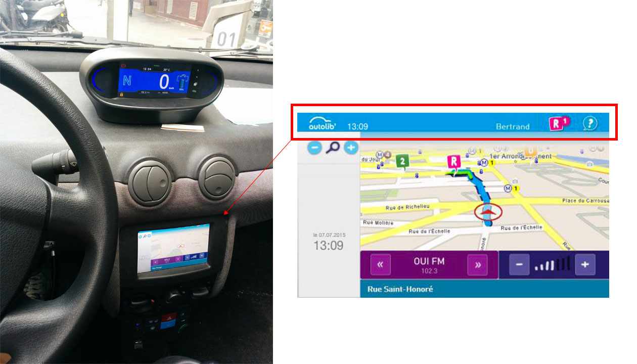
One important menu is displayed in this area : the parking reservation. I suggest to place this menu in the same arrival time and settings block.
Missing features
With Autolib’, the more you use a car, the more you pay, like in a taxi. It means that time is a clue for your trip and not being trapped in a traffic jam is really important. The actual embedded GPS does not consider the traffic and it’s really a mess, because I have to open Waze app on my phone to be sure I take the fastest route. I often put my phone on the right front seat, but sometimes strong breaks happen and the phone is projected on the ground.
I don’t know if Autolib’ will develop its own navigation system. Time, cost and maintenance can be too restrictive and very good solutions which can be implemented already exist such as Waze. But data are so important keys to improve products, having it’s own solution could be interesting. Maybe the best solution is to create a win/win partnership with a company like Waze for the delight map and smart trafic suggestions on the screen by incorporating a data sharing on the specific Autolib’. It is not necessary to put all the point of interest (restaurants,…) informations, but at least the traffic.
Information hierarchy and organization
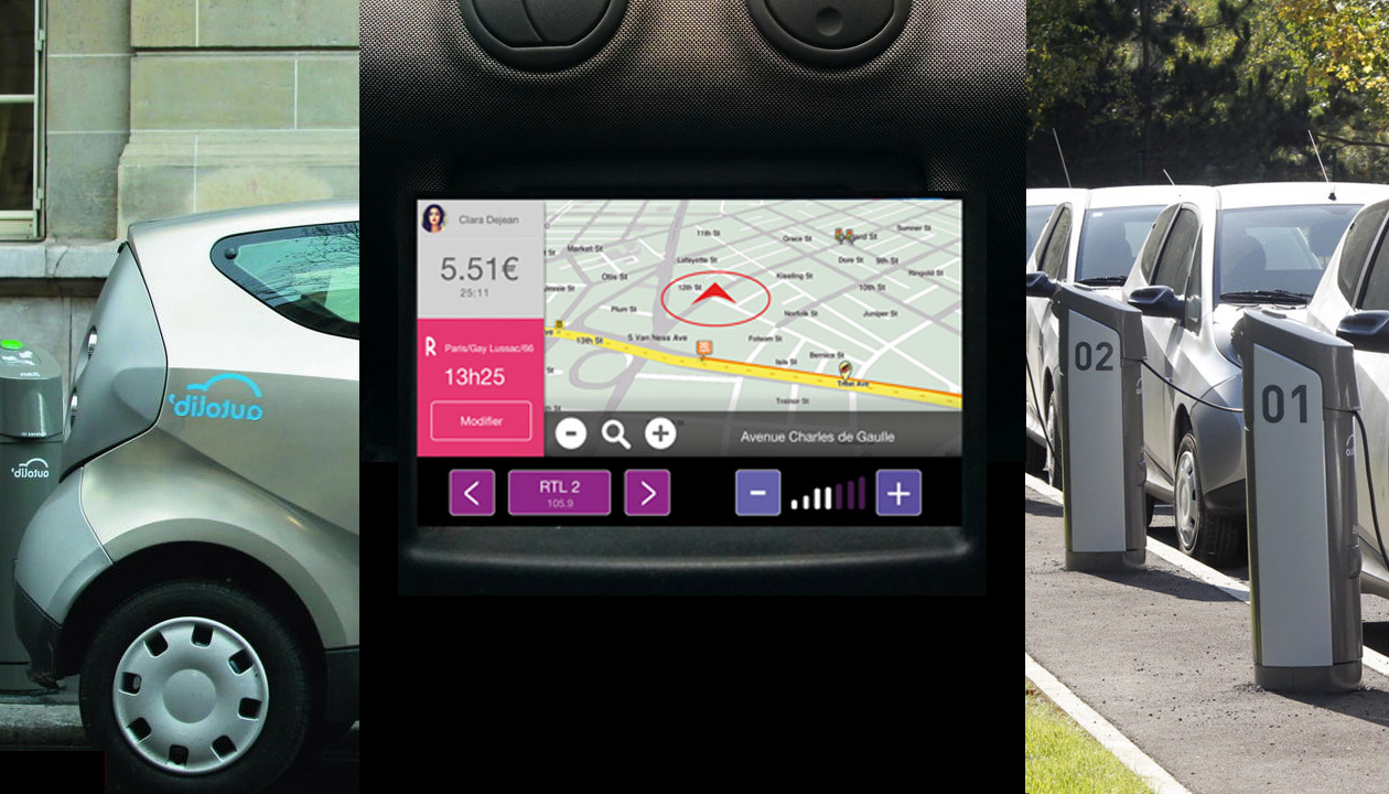
Information can be really prioritized by color, sizes and positioning. On the screen, there are a lot of colors and it’s hard to have a focus point.
As a driver, the informations i want to find quickly are :
1) My speed – OK
2) GPS to show me the most efficient way to get to my destination – very bad
3) Cost of the trip – not displayed
4) Arrival time et settings – always wrong
5) The clock – displayed 3 times
6) Music or Radio – OK
On the actual dashboard, we can see many dispatched informations about the map.
For example :
– the map zoom is on the grey left part where information about the arrival are
– the current street name is down the radio and volume button
These two informations should be on the map block.
Proposal
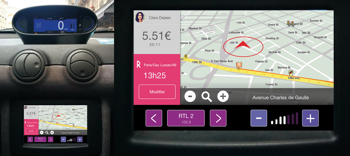
1) Group all the different element of the map. Zooming buttons, street name with the map.
2) Create a block reservation
3) Reduction of the number of the colors to make the dashboard more clear.
4) Add a picture for the user name because an image is better than a thousand word, users are used to see a picture to symbolise their profile.
5) For the sound block : using a black color background for the sound block to melt it with the car board.